Crafty Gals Corner - Owner & DT Coordinator

Crafty Gals Corner - Owner & DT Coordinator
January 2015 - Current

Faery Ink DT

Faery Ink DT
January 2015 - Current

Conie Fong Art & Design Coordinator

Conie Fong Art & Design Coordinator
January 2016 - Current

MoonFlower DT

MoonFlower DT
March 2016 - October 2016

Paper Temptress DT

Paper Temptress DT
October 2015 - June 2016

Sassy Studio Designs FB Coodinator & DT

Sassy Studio Designs FB Coodinator & DT
April 2015 - February 2016

Ching Chou Kuik FB DT

Ching Chou Kuik FB DT
September 2015 - April 2016

GDT - April 2015

GDT - March & April 2015

Showing posts with label Tutorials. Show all posts

Thursday, November 19, 2015

BS Sessions #3: Blender Pens!

Hello there fellow crafters!

A while ago, Becca (Damsel of Distressed Cards) and I announced that we had collaborated to bring you "The BS Sessions". 

What are the BS Sessions? 
Well Samantha knows how to work a marker like nobody's business and Becca loves to get messy with mixed media. We both wanted to learn the other person's crafty secrets so we're going to ask one another a question on the last Thursday of the month. Becca will provide you with some amazing Mixed Media techniques and Samantha will show you some tips and tricks about coloring! We'll both provide our followers with a little tutorial, because if we have these questions - our followers might too!

So Becca's question to me this month was: "Do you need a blender pen, and what is it for?" 

This is a tricky question, I would say you do not necessarily NEED a blender pen, but I highly recommend it as they do come in handy in certain situations! In my opinion there are three main uses for a blender pen.

I should note that, despite it's name, it is NOT used for blending! If you attempt to blend alcohol markers with this pen you will end up with a muddled, de-saturated mess. Why? Blender pens are pretty much straight alcohol. So, when you attempt to blend other colors with the blender pen, you are actually "removing" the color. 

Onward to what you CAN actually do with this pen. 

1. To color "white" things:


See how I left parts of her dress white? Well I used a combination of colors and used my lightest color to blend out the rest of the colors and then used my blender to go from the white area and just barely blend over the lightest color. In this case it was RV10, but in Spectrum Noir any of the "1's" to create the same effect. Unfortunately, I could not get a great picture to show you a before and after, so, don't take my word for it, TRY IT! :)  

2. To create cool effects:

So, this doesn't happen often, for me at least, but there are those rare times where I can use this technique to create a neat effect on some clothing on an image. As you can see above you can do stripes, plaid, spots, dots, swirls, etc. 

I also found this by Jennifer Dove and thought it'd be neat to share it!


3. To rectify a mistake:
There are those times when you accidentally go out the lines, and that's another handy reason to have a blender on hand. As I stated earlier, the blender pens "remove" color because it's basically pure alcohol. So the best way to do this (in my opinion) is to use the chisel nib and "push" the color back. Start with the chisel nib a little further back than your mistake and "drag" the color back to the line. Make sure you don't go INTO the image because it will remove that color too. The lighter the color, the easier and better results you get for "removing" the color. If you are trying to do a dark red or black you may not be able to get rid of the whole thing, but it will definitely lighten it up enough to where you barely notice it. 


In this tutorial I am using Copics, but you can apply the techniques to ANY brand of marker!

**FINAL NOTE** - The blending cardstock you uses MATTERS! It makes a world of a difference in your coloring! My favorite is Heavenly White 80# Cardstock which is sold by The Paper Temptress! Not sure what kind of blending carstock is right for you? NO PROBLEM! She offers a "Blending Copic Sample Pack" Which allows you to test a variety of blending cardstocks so you can find YOUR favorite. 

SO, thanks for joining me on the skin coloring tutorial today! Becca has provided an AWESOME mixed media tutorial on her blog - GO CHECK IT OUT!


Stay tuned for next month's BS SESSIONS, which will appear here on November 17th!

Missed the previous sessions? You can still go back and check them out:

1st Session - How to color skin tones?
2nd Session - How to color black hair?


Thursday, October 15, 2015

BS Sessions #2!

Hello there fellow crafters!

A while ago, Becca (Damsel of Distressed Cards) and I announced that we had collaborated to bring you "The BS Sessions". 

What are the BS Sessions? 
Well Samantha knows how to work a marker like nobody's business and Becca loves to get messy with mixed media. We both wanted to learn the other person's crafty secrets so we're going to ask one another a question on the last Thursday of the month. Becca will provide you with some amazing Mixed Media techniques and Samantha will show you some tips and tricks about coloring! We'll both provide our followers with a little tutorial, because if we have these questions - our followers might too!

So Becca's question to me this month was: "How do you color black hair and black clothing?" 

Well first off, it takes A LOT OF PRACTICE! Nothing works the first time around, it's something you have to keep working at. 

Secondly, I learned A LOT from the Kit & Clowder Coloring Classes.

In this tutorial I am using Copics, but you can apply the techniques to ANY brand of marker!

I did this technique with two different color combos for Black and two different images! 

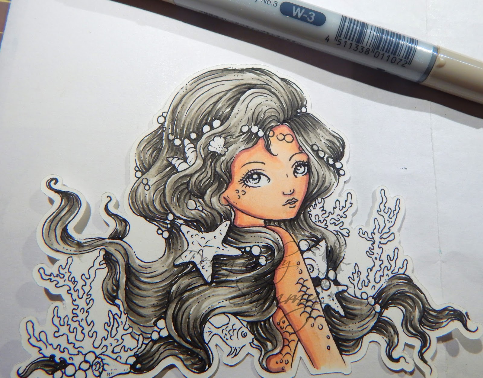
 The first image is: Embrace the Ocean by Ching Chou Kuik

Copic Markers - W9, W7, W5, W3, B24 (optional)

Spectrum Nor: BG9, BG7, BG5. BG3, TB4 (optional)

So - quick note - Hair can be difficult and it too takes A LOT of practice! However, I hope this tutorial gets you started in the right direction and that you have fun with it!

Step 1: The first thing you want to do is start with your darkest color (W9) and add your strokes where the darkest parts would be - aka the shadows. As you can see here, the pearls would cast a shadow on her hair, so would the "dips" in the hair, smallest points (like ends), and around her face. These strokes can be thought of as "Flicks" - You start with the point in the darkest part and flick outward towards the lightest part of the hair. THIS is the hardest step - the rest seem to fall in line :)


Step 2: Take your next color (W7) and go in between the darkest strokes (flicks) you just created and extend them a little further than the last strokes. 

Step 3: EXACTLY the same as Step 2 - just extend it even further towards the lightest part of the hair.


Step 4: Getting the hint here ;) Same thing again, each time you just extend the color out a little further. The more colors you use the more the colors will eventually start to overlap giving you that definition you want to see. 


Step 5: OPTIONAL - Since she was a mermaid I decided to use a fun color to streak it through her hair. In this case, I used B24. In this step I just streaked some of the color through what I'd already colored and made sure it went from the darkest part of the hair to the lightest part. 


VIOLA! You've got yourself a beautifully colored hair! By the way you can use this technique FOR ANY COLOR of hair!

Here's the final piece colored in case you're interested in seeing it!


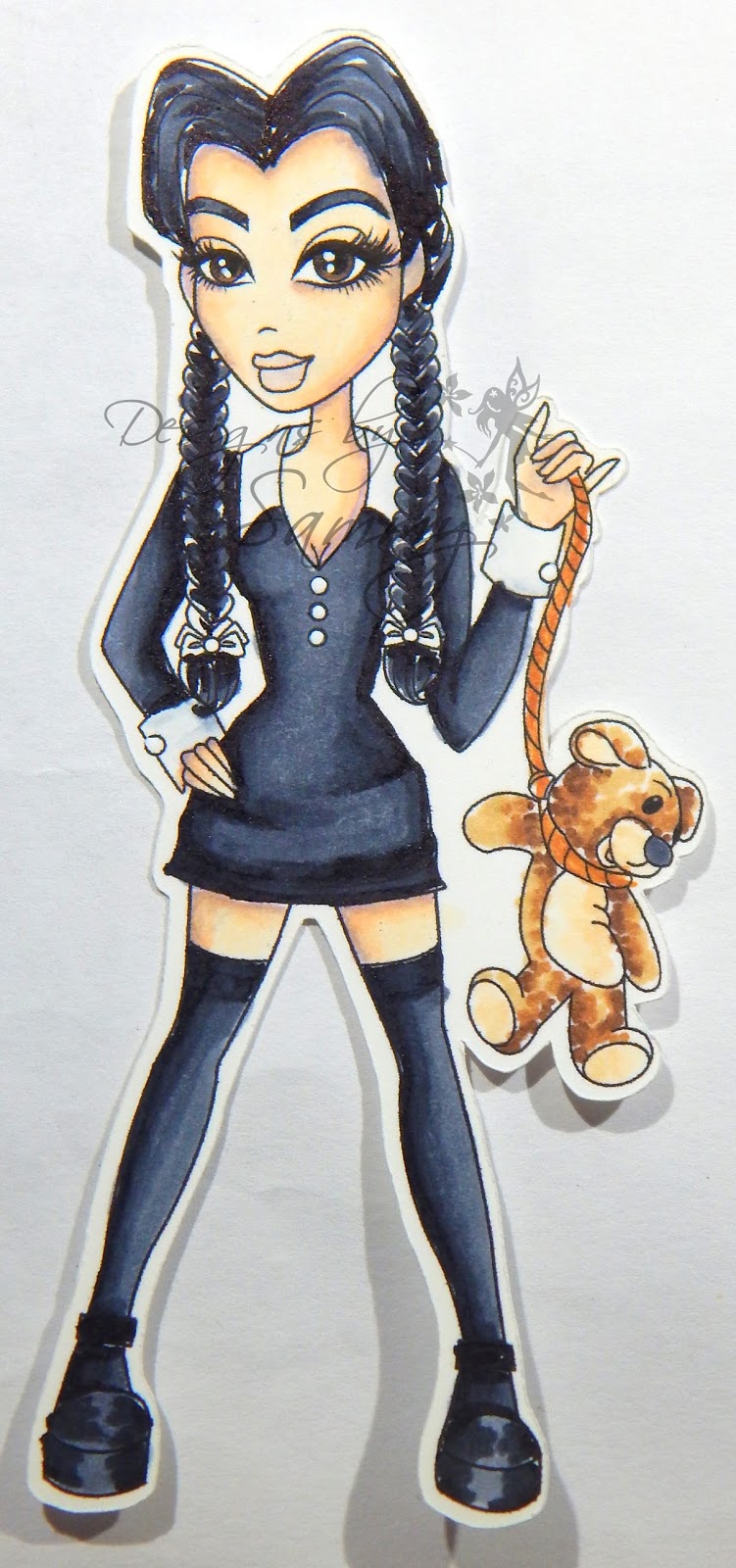
So here's the second part of the tutorial! In this example I colored, what we would consider, jet black hair and also black clothing. 


Anyone else a fan of the Adams Family?!


Copic: C9, C7, C5, C3

Spectrum Noir: IG9, IG7, IG5, IG3


Step 1: I like to color my areas that are going to be black with my lightest color (C3). This does two things:
1 - It prevents me from messing up and coloring another part of her black accidentally (like her legs)
2 - It gets a good saturation on the paper and allows blending to be much easier. 

Step 2: Using your darkest color (C9) - color where the darkest parts of her outfit would be. Anywhere there would be a shadow should have this color.

Step 3: Take your next darkest color (C7) and extend the color a little further out. Don't go completely over what you've already colored because it will de-saturate the color and look a little funny. When you color just go over the edges of where the last color ended so you get a smooth blend. 

Step 4: Take your next color (C5) and repeat step 3.

Step 5: Take your lightest color (C3) and blend in the rest of the empty space to make the blend seamless. 

Step 6: The hair works exactly the same way as the first tutorial. Your darkest color (C9) should be in the shadows and darkest parts of her hair and flick outward.

Step 7: Next color (C7) and extend a little futher.

Step 8: Next color (C5) and extend further. Since this hair was small to color, I didn't need to use C3.


Here is the finished image! Although I didn't do it in this tutorial - I HIGHLY recommend, when coloring with very dark colors, to do it LAST! It was very difficult to color her skin afterwards without pulling some of the black into it!


**FINAL NOTE** - The blending cardstock you uses MATTERS! It makes a world of a difference in your coloring! My favorite is Heavenly White 80# Cardstock which is sold by The Paper Temptress! Not sure what kind of blending carstock is right for you? NO PROBLEM! She offers a "Blending Copic Sample Pack" Which allows you to test a variety of blending cardstocks so you can find YOUR favorite. 

SO, thanks for joining me on the skin coloring tutorial today! Becca has provided an AWESOME mixed media tutorial on her blog - GO CHECK IT OUT!
Displaying PicMonkey Collage.jpg
Stay tuned for next month's BS SESSIONS, which will appear here on November 26th!


Thursday, September 24, 2015

BS Sessions #1

Hello there fellow crafters!

A couple weeks ago, Becca (Damsel of Distressed Cards) and I announced that we had collaborated to bring you "The BS Sessions". 

What are the BS Sessions? 

Well Samantha knows how to work a marker like nobody's business and Becca loves to get messy with mixed media. We both wanted to learn the other person's crafty secrets so we're going to ask one another a question on the last Thursday of the month. Becca will provide you with some amazing Mixed Media techniques and Samantha will show you some tips and tricks about coloring! We'll both provide our followers with a little tutorial, because if we have these questions - our followers might too!

So Becca's question to me this month was: "How do you blend skin so easily?" 

Well first off, it takes A LOT OF PRACTICE! Nothing works the first time around, it's something you have to keep working at. 

Secondly, I learned A LOT from the Kit & Clowder Coloring Classes.

In this tutorial I am using Copics, but you can apply the techniques to ANY brand of marker!

STEP 1: Gather the image you want to color! The Copic colors I used for this Skin Tutorial are: E000, E00, E21, E11, E04 <--- In that order from lightest to darkest.

For Spectrum Noir: FS1, FS4, FS9, TN3, TN4


STEP 2: Take your lightest color (in my case E000) and just color in everywhere there is skin. This gives it a base color to work with and it makes it easier to blend later.


STEP 3: Take your darkest color (E04) and lay it down where your shadows, or darkest areas would be. *This is the hardest part - the rest is easy peasy!*


STEP 4: The next step is to take your second darkest color (E11) and go over your shadow area and extend the color out just a little bit.


STEP 5: Then you use your next color down (E21) and do the same thing! However you start this color at the end of the last color (E11). So you don't want to start from the very edge because this will end up de-saturating your colors. 


 STEP 6: You take your next color (E00) and extend the color a little bit further in.


STEP 7: Take your lightest color (E000) and then fill in the gaps. Remember not to color over your whole image as it could de-saturate your colors.


STEP 8: Now that you skin is all done - You need to add in your blush (R20)! For this step you start wide on the checks and work your self in on the face so it comes to a soft point. This should look triangular.


STEP 9: You then take your lightest color (E000) again and go over the edges of where you just colored your blush. 

VIOLA! You've got yourself a beautifully color skin tone!

Here's the final piece colored in case you're interested in seeing it!


SO, thanks for joining me on the skin coloring tutorial today! Becca has provided an AWESOME tutorial on how to use a stencils and produce SHARP and CLEAN lines for mixed media or anything you can use a stencil on really!

Stay tuned for next month's BS SESSIONS, which will appear here on October 29th!


Sunday, March 29, 2015

How to add a Watermark to your projects!

Hello there!

So recently I've been asked many times how to add a watermark to your pictures. Well, today, I'm going to show you. :)

For a while I've been e-mailing this document to people who have requested but I suppose the time has come to share with the world!

So here ya go - as always if you need any further clarification feel free to e-mail me : Samantha.h.aguilera(@)gmail(.)com

I ALSO MAKE CUSTOM WATERMARKS IF YOU ARE INTERESTED

How to Add a Watermark to Pictures:

**Please refer to the directions below in order to successfully add a watermark to your pictures! These directions are using a FREE software called Paint.net**


2. Click on the green “Download Now” button

3. Once it’s downloaded, click on the application titled “paint.net.4.0.5.install” and follow on screen instructions.

4. Once the software is downloaded click to open the program

5.  Once the program is open it should look similar to this:

6. The first thing you want to do is go to File > Open > Find the picture of the card you want to add  > Open

7. This next step is easiest if you have your watermark saved to the desktop, and have the program in “Restore Down”


8. Click & drag the watermark from the Desktop to your picture in Paint.Net
9. A box will come up and then click “Add New Layer”

10. Make sure the BLUE arrow is selected and then resize and move your watermark to where you want it to appear

11. The next thing you need to do is save your image as a JPEG
12. Go to FILE > SAVE AS > Change SAVE AS FILE TYPE to JPEG

13. A box will pop up that says “Save Configuration” – Click OK


14. A SAVE box will pop up asking if you wanted to FLATTEN the image – Click FLATTEN


15. There ya go! Once you open up that file it should have your brand new watermark on it! I hope this tutorial helps and if you have any questions please let me know. J